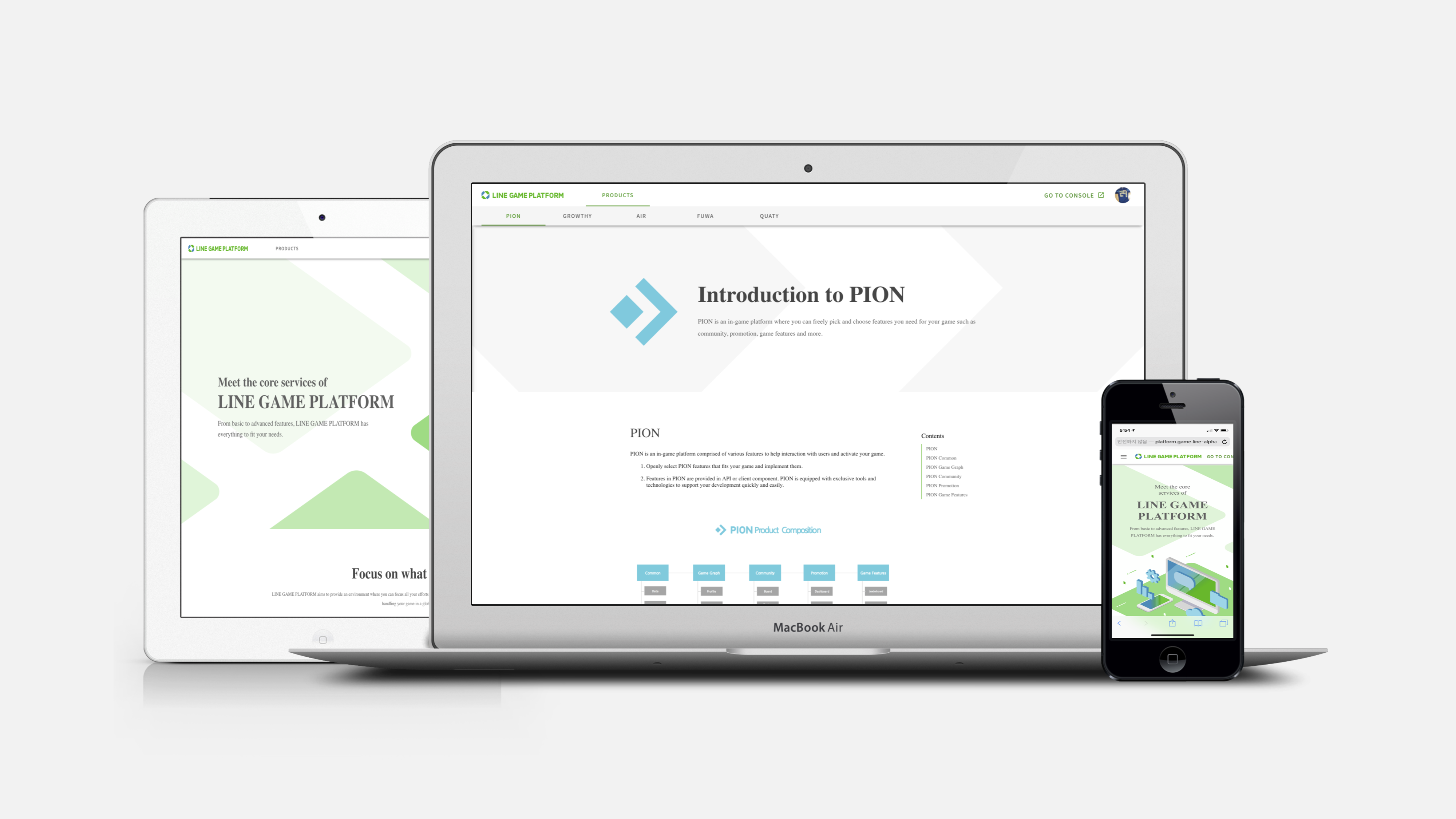
As a Product Manager/Designer, I was in charge of the Redesign project for GAME Developer Center (called ‘GDC’), which is a in-house web site for the partner developer, and provided in-game platforms such as leaderboard system, achievement system, and game stamina system.
I Designed each game product’s functional policies, API/Parameter sets, and web UI/UX structure by collaborating with each product managers with regards to UX strategy, process improvement. Especially, with technical writers, I adopted new workflows and opensource documentation tools to successfully provide the fist qualified guide document service in LINE.
Beginning
In the GDC, we introduced our web service to game developers , which is providing setting management, developing guides, and testing tool to implement LINE features on their games. Although, we have been trying to give a hand to game developers, there are still some complains because of various legacies and complicated UI. Accordingly, we have decided to initiate project that would be to proceed website designing with a new UI for refining inconveniences.
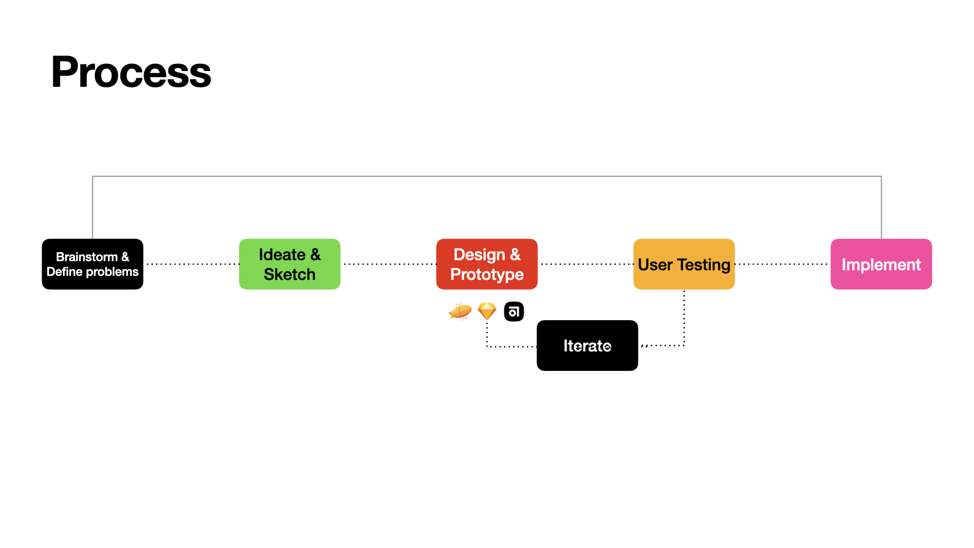
Brainstorm & Define problems
We started with analyzing key problems of previous GDC usage, and then established goals of improvements. We have identified 3 drawbacks in total.
Complex communications such as system of developmental documents
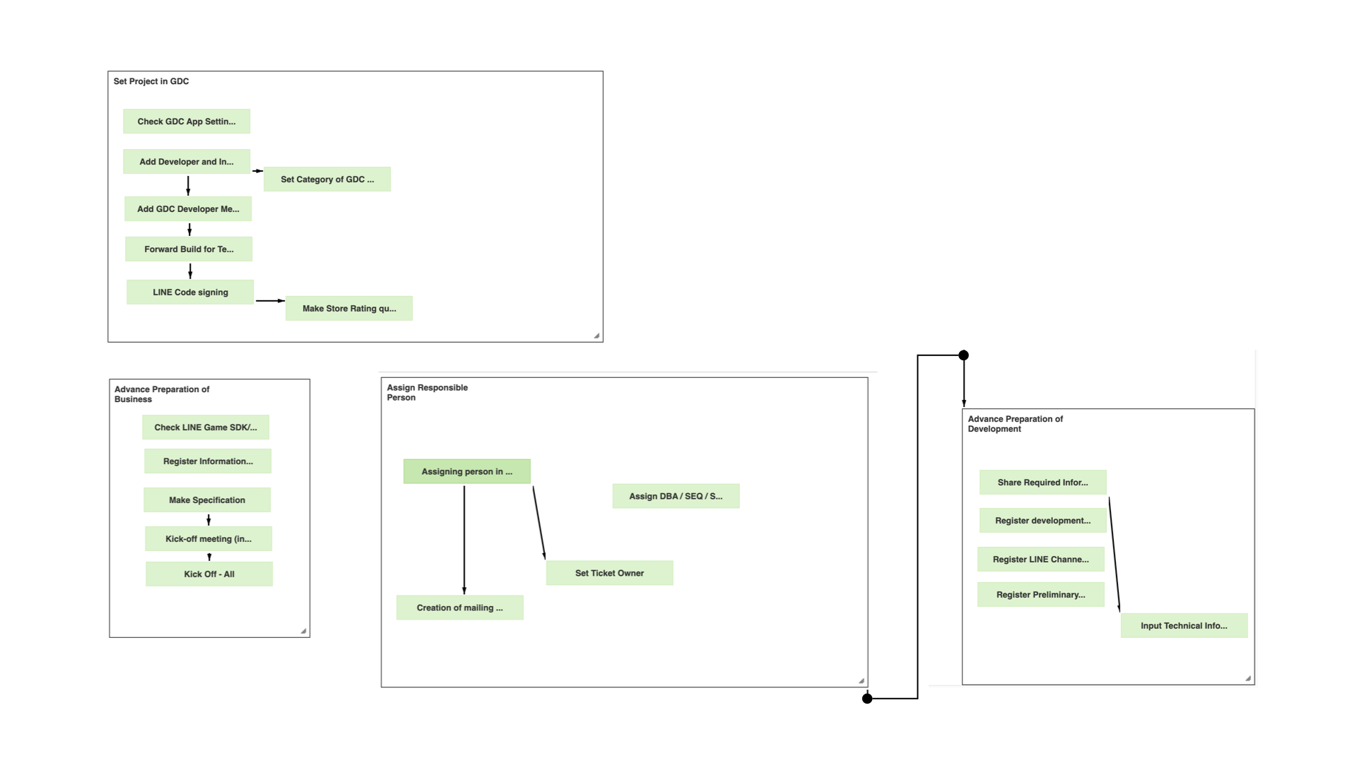
The game developers needed a lot of keys such as SDK, guides and App ID to integrate their games with SDK or LINE’s features. Those works are required active communication among the developers not only by their roles but also by contracts. In exiting GDC, we have communicated in various ways like providing guiding PDF books and assigning dozens of task sets through our internal issue tracker tool.
Insufficient convenience functions and UI design
Since the old GDC was a forum-centric communication tool, it lacked some critical features for game release such as uploading files for QA. And as we had continued to use the website thrown together through Bootstrap, the UX- with a poorly designed UI, lacking consistency- had also been a problem.
So, in the brainstorming stage, we identified this problem and thought of a way to improve the usability of the website for our target users- game developers.
Also for the sake of ideal user flow, we planned to make a simple user-centered design application through integrating critical functions that developers needed to minimize complex workloads. After brainstorming, we decided to add new functions like build distributing functions such as Wiki, Issue tracker, Play console etc.
Ideate & Sketch
We iterated our wireframe design by conducting informal usability testing with the mid-fidelity prototype. Our participants provided feedbacks on error-prevention methods, accessibility, and discoverability of the UI.
Document feature
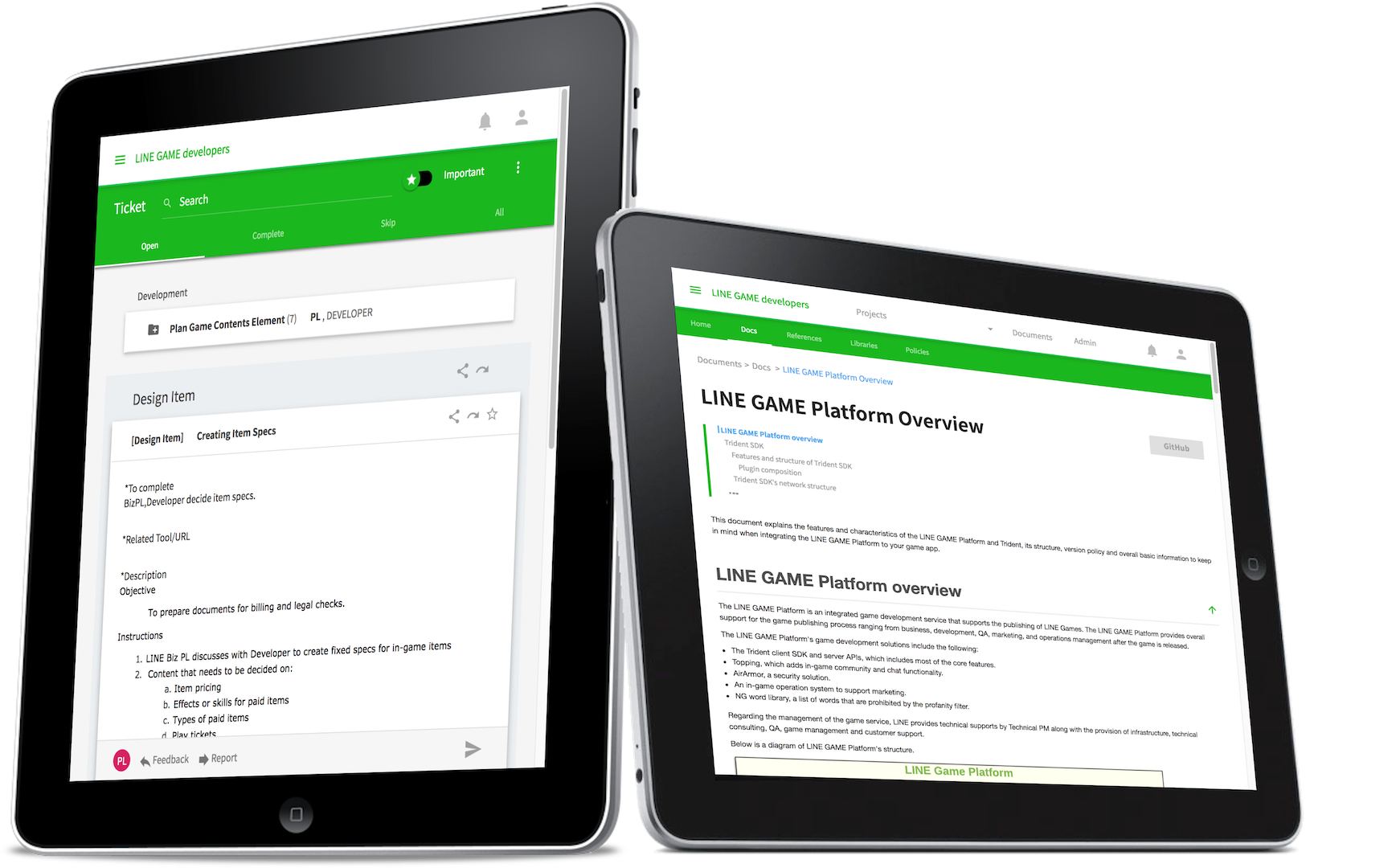
We divided dev guides into ‘Ticket’ guides that act as tips for your development and businesses, and ‘wiki’ guides explain development functions in more detail. So we drived users to read the Ticket guides to get a brief introduction, and made them to move on wiki to find out more.
Build submit feature
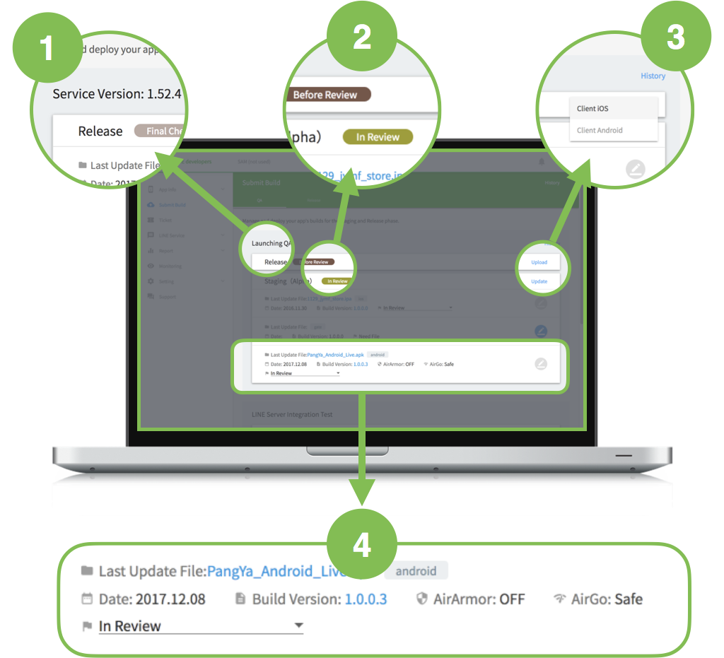
As I was designing the UI wireframe, I realized that the most important function of this app lies on simply uploading developers game builds and receiving QA services. So we add new features for users to See all of their submit & review information at once.
Mobile feature
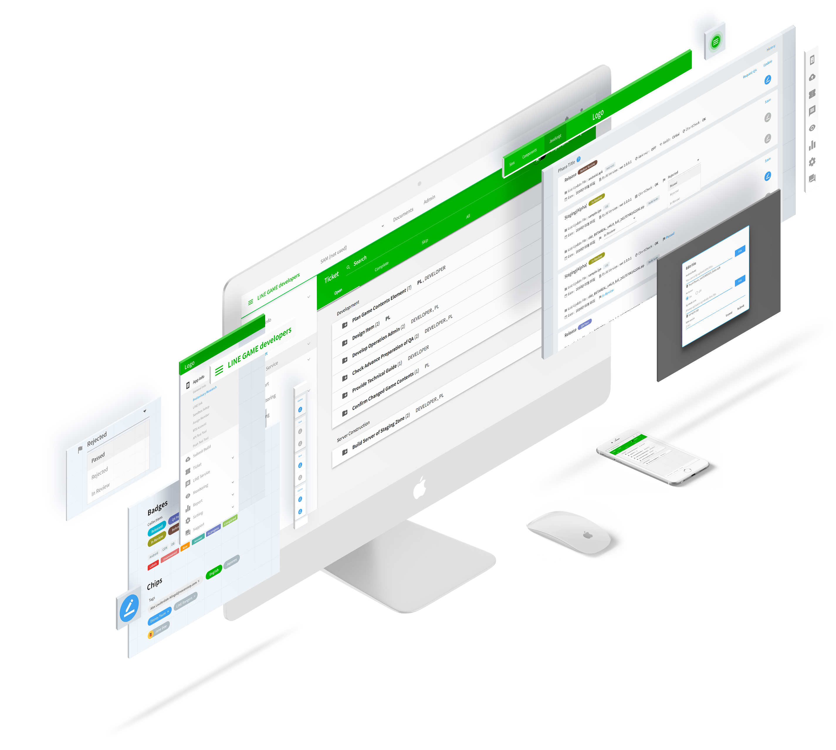
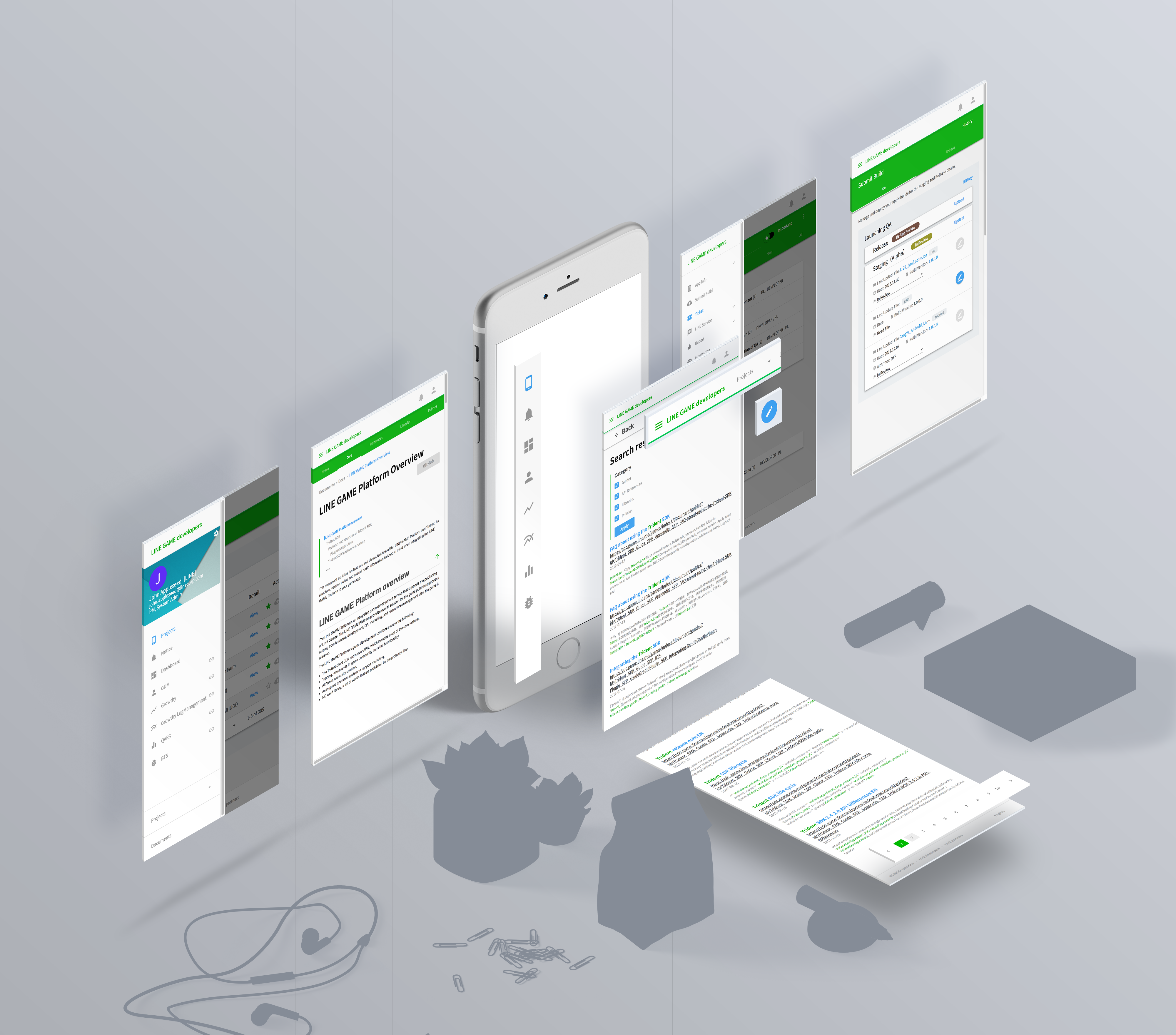
Lastly, I redesigned all of its UI components to support the responsive web. The reason was we found from Google analytics data that almost 15% users visit this website through the wiki links they received on mobile such as LINE messenger or email.
UI Design
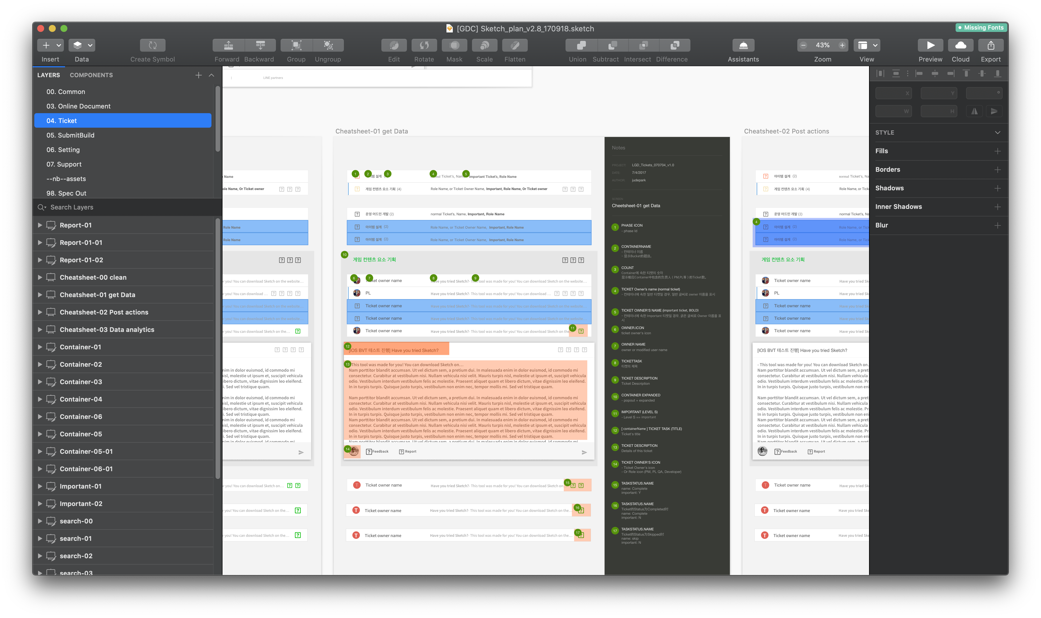
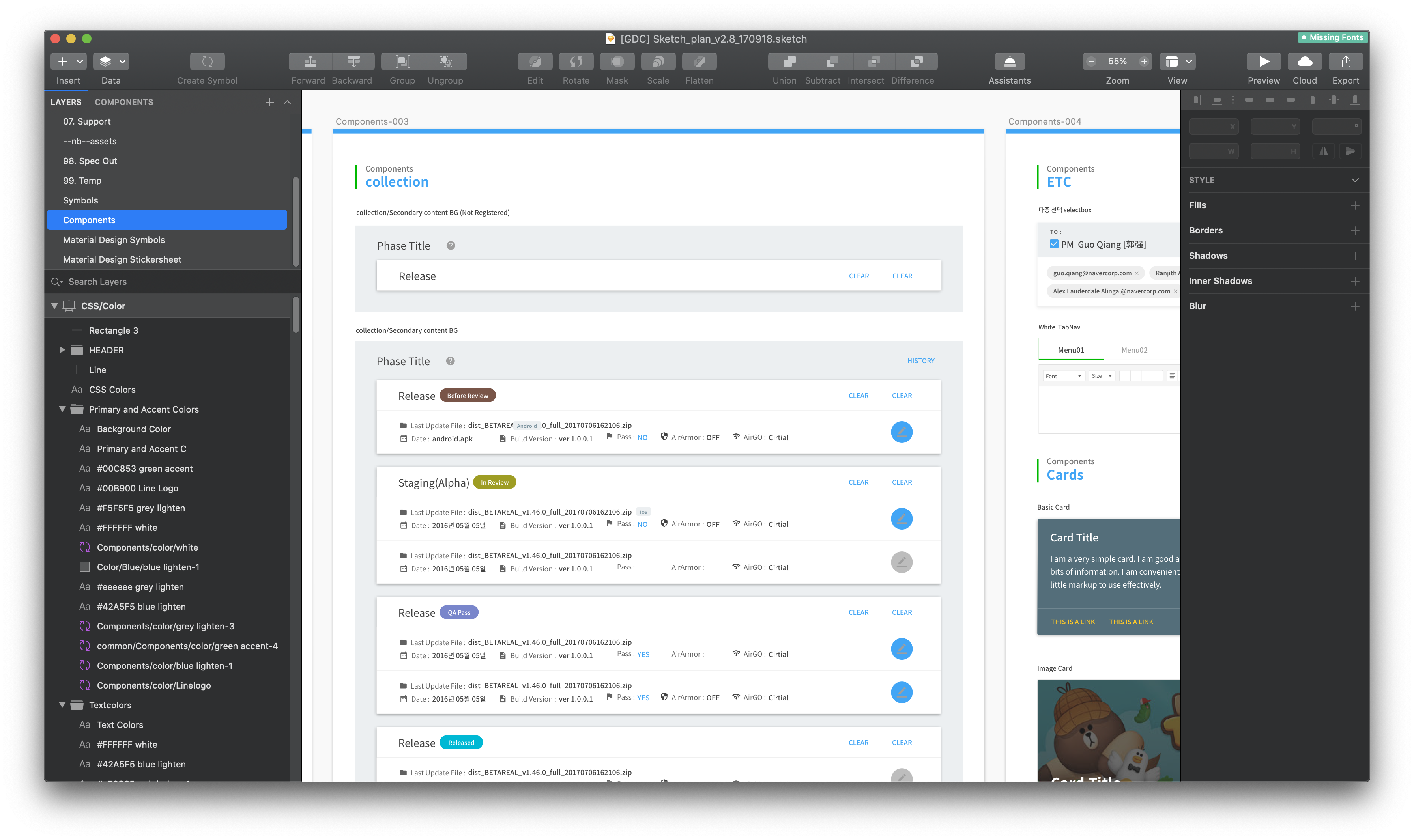
After we all agreed its concept and functional spec, I started designing the UI and components via Sketch/Zeplin.
Implementation and release
My teammate lead the implementation in vue.js and I helped with CSS code and animation guides. This video is edited with real screen capture of working web application.
