LINE’s LIFF (LINE Front-end Framework, LIFF as below) is a platform for running web apps and offers a browser, namely, LIFF Browser. LIFF apps, web apps implemented with LIFF, run on LIFF Browser. LIFF also provides the LIFF API for developers to obtain data from LINE, such as LINE user ID, and enables developers to send LINE messages on behalf of the user. Learn more details here.
But there were lots of product owners and partners who have been wanted to specify the size and structure of the browser to fit for their services. So we started a project to add a new view type, which allow layout changes to provide suitable UX for their service.
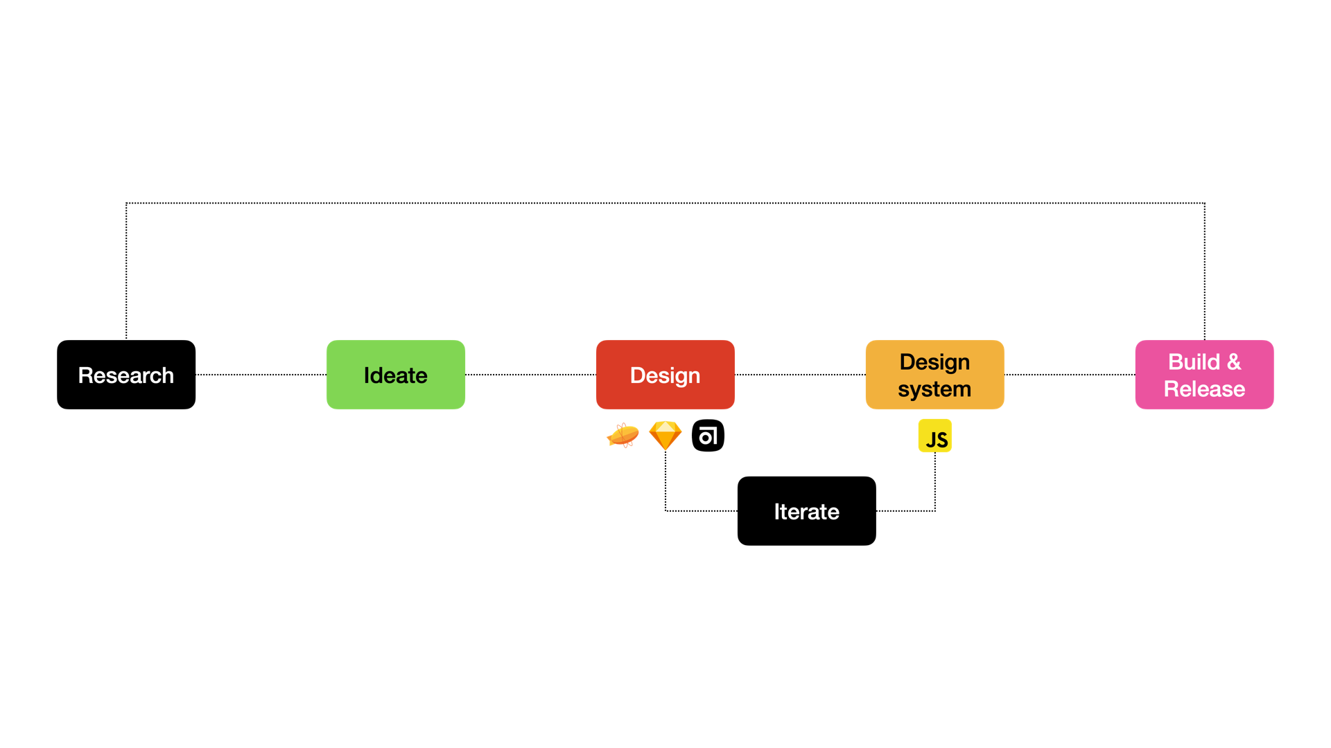
Research
So we looked at the UX of almost all of LINE family services and found the following pain points before designing the LIFF area.
Native + web area
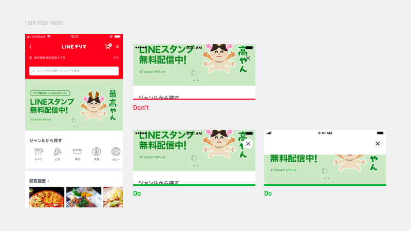
LIFF app screens consist of a ❶ native area and ❷ web area. Elements in the native area are for web browser features such as back button and close button. Web area is for displaying service content. So, we had to consider not only the UX of the web app, but also the harmony of the features of the web browser.
For example, the header of in-app browser has native buttons by default in the FAB (Floating Action Button) section, located at the top right-hand side corner. So designers got stress not to alter nor block this section when they design the header.
If the designer allocate the close button in the right-hand side, the button and the content overlap when the user scrolls the page. SoEach designer separately found their own ideas such as getting around this by keeping the FAB container on or adding a container with white background in the web area.
Hard to offer consistent modal experience
to users across LINE services
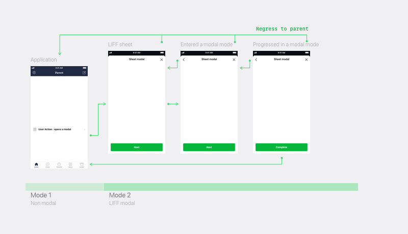
Carelessly designed UI results in increased user bounce rate. Using modal sheet provides flexibility in UI design, which is why it is popular among many of product owners. One downside to this is that the modal pattern enables users to close the LIFF app anytime. An unexpected side effect of using the modal was found in requiring multiple tasks on a complex UI, resulting in users exiting the service. Such problems rise due to the conflict between user’s expectation and the UX.
Ideate
We tried to find a way to set user’s expectations to meet what LIFF apps provide and to enable users to comprehend LINE’s modal environment by using appropriate LIFF modal type.
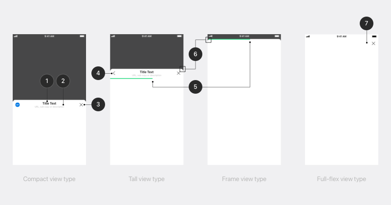
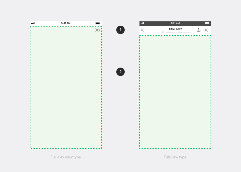
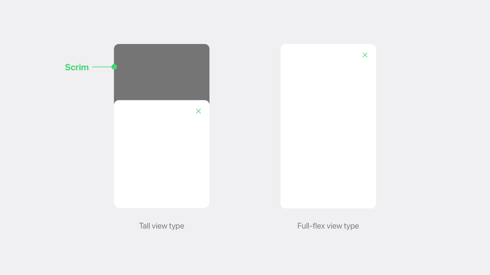
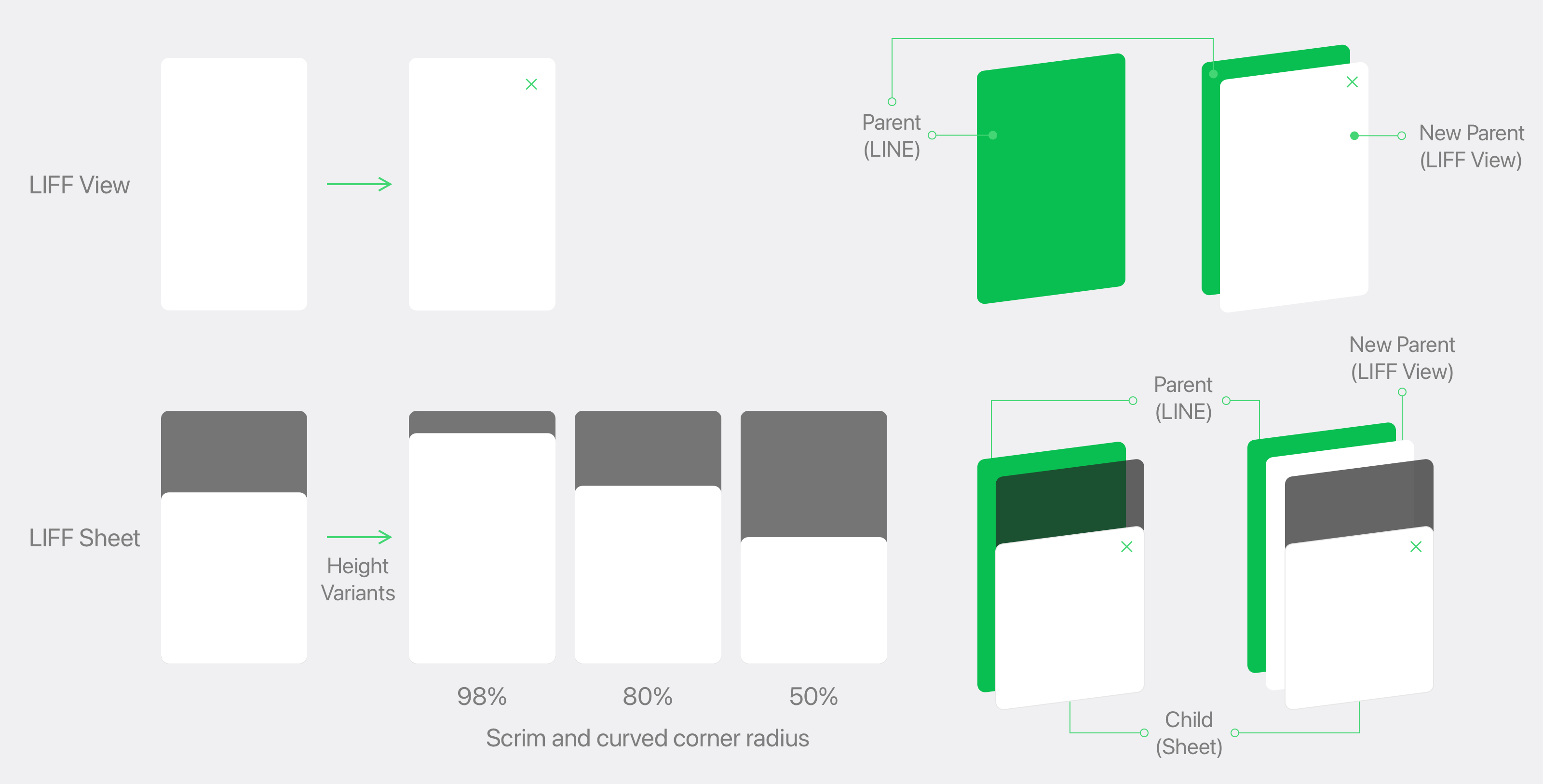
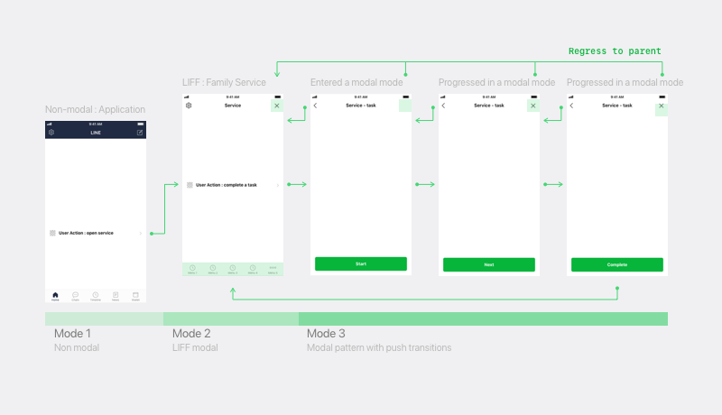
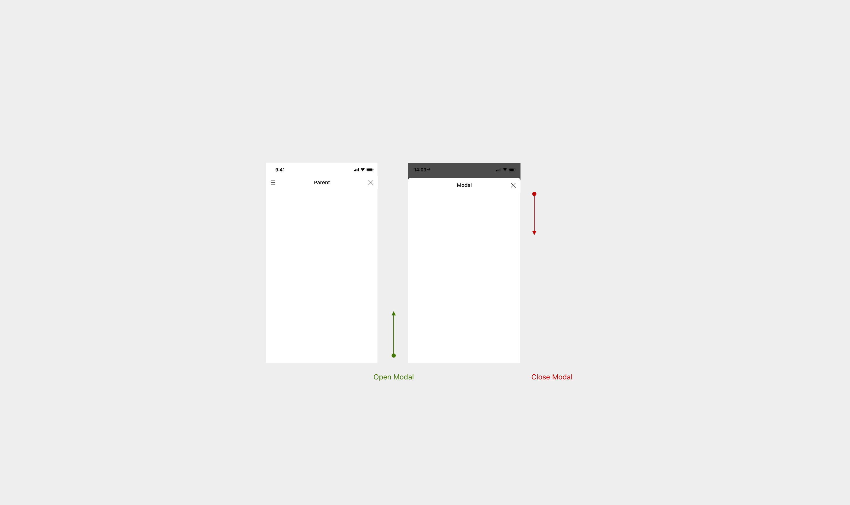
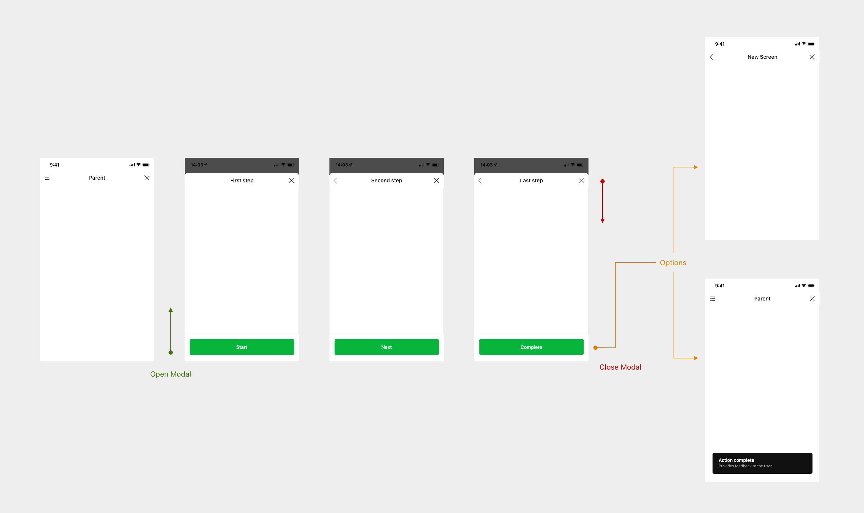
Modals are the windows that LIFF Browser displays web contents in. We decided to classify this modal type into two modal types as shown below. Depending on the type, user expectation and UX we recommend vary.
- LIFF sheet: The black area outside the sheet is called scrim and the page underneath is deactivated. LIFF sheet corners are rounded.
- LIFF view: LIFF views are basically displayed in full screen.
Design and Iteration
After deciding on these UX principles, we started design process. Our Senior UX designers, Dane and June, drawed various UI/UX patterns and I took the responsibility to generate the design system assets from Sketch to Javascript and lead in having an in-depth conversation with TPM and engineers to overcome technical limitations.
Build
Finally, we explored how to distribute the new design to make it the easiest way to reach all designers and FE developers. After several discussions, our engineering team selected a webComponents technology that could work in a variety of web platform environments, and as a member of the design system team, I upgraded our existing LINE Design System website(Gatsby) to effectively showcase web component-based UIs.
In addition, I led the collaboration with the Technical Writing team to rewrite, translate, and successfully distribute our complex UX documents to our website.
Result
Finally, we distributed the LIFF Guidelines document, Sketch symbol library, and Web components(js) in-house through the LINE design system. The response was great. In the 3 weeks after distribution, customer inquiries through Slack increased by more than 40%, most of which were from product owners about how to apply a new view type to the product.
In addition, LIFF UI, part of this project, was even introduced to the public as one of LINE’s major FE project achievements through LINE’s annual developer event.