LOOKBOOK is the UX extension library for reusable, systematic design based on Google Material Design System backed by Open Source.
In this project I did the following tasks:
- Initiated the project and extended the Material Design for adapting into various specifications and requirements from product team and engineering team.
- Created and managed Sketch Libraries, React components, and UX guides through various tools such as Github, Abstract, Zeplin, and Zeroheight.
- Supported product launches and feature updates by providing LOOKBOOK’s assets and componenets.
- Contacted Google Material UX team and received a design review on LOOKBOOK libraries, design, and its related workflows.
The post below explains why LINE’s game platform team created LOOKBOOK, and how we used open source and contributed again.
Why, did we need to improve our management tools?
LINE does have a large number of products. Some of these products are end-user products into which a large number of resources are spent, such as LINE or Family Apps. For other products, such as managing tools created on the web, the number of products that need to be created is high but it is difficult to spend a large number of resources.
Since these are services for internal administrators, mostly it is acceptable to not spend much time in developing, thus it is pushed back on the priority list. LINE also has various managerial admin pages, more than end-user services.
Therefore, it is very significant in the product design of these managerial products to utilize a small number of resources most efficiently to provide the same user experience.
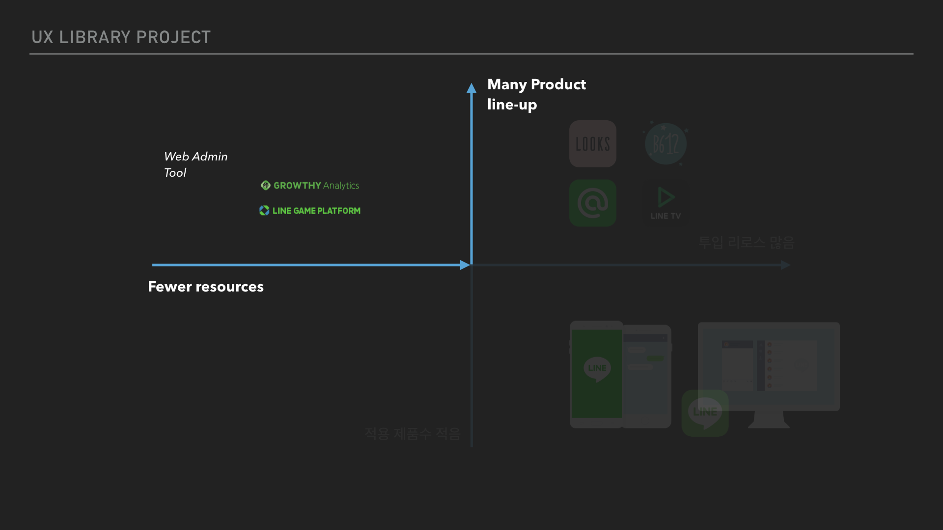
LINE GAME platform team have been providing various social platforms such as game messages and social graph. It is providing much more back office management tools that what it looks like on the outside. Due to such situation, we’ve designed and developed more back office tools than any other teams in LINE. We also had many experiences to purchase libraries or request for outsourcing in order to work even more efficiently.
However, on the contrary, we’re also the team that experienced the most problems due to this.
- There was limitations to build up its technical/planning know-hows because the environments for each product were different and varies.,
- Therefore, even in the same circumstances or situations, it provided different operational methods for each product such as location or colors for buttons,
- Eventually, this led users learning cost and human errors.
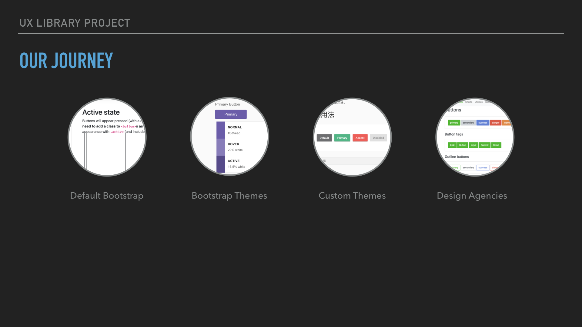
Moreover.. many admin products, that were developed by one developer alone without designer or PM’s supports, did not escape from basic UI provided by some framework or themes that they relied on. Obviously products ranging from Vue and React to the old version Bootstrap, the environment of products were very inconsistent. We have even experienced a waste of resources to solve these issues, such as repetitively outsourcing or using a common library.
Therefore, the LOOKBOOK project has started to seek a solution by reusing components as a way to reduce this repetitive cost, concerns, and mistakes.
Why Opensource?
You cannot make software by yourself
A well-known method of re-using components is to make the design system. Great design systems such as AirBnB’s Design Language System(DLS) and IBM’s Carbon facilitate product design and development productivity, much like purchasing parts from IKEA and assembling a piece of furniture. And LINE, of course, runs its own Design System called LDS but it is currently focused on key products only such as LINE app, as mentioned before.
Frankly, including the entirety of back office products and tools in the design system is inefficient as well as impractical. Because we cannot create all components and establish a design system on our own. Even we develop some excellent things, if our colleagues from other team relies on different frameworks, it leads to another same work-shift.
In actuality, many products have disappeared of lacked maintenance due to the absence or turnover of main developers, so as other many products produced by NAVER or LINE. That’s why we needed a way for sustainable project.
Opensource itself was not the answer. Let’s indirectly expand!
In the research process, we found the solution to all these problems in the case of NAVER’s chart library.
We had predecessors who went through the same kind of problems. They started off from the same situation. Our predecessors at NAVER created chart libraries used in operating tools for NAVER Café and Blog on their own, and even used commercial and opensource libraries, but they said the limitations for each were clear.
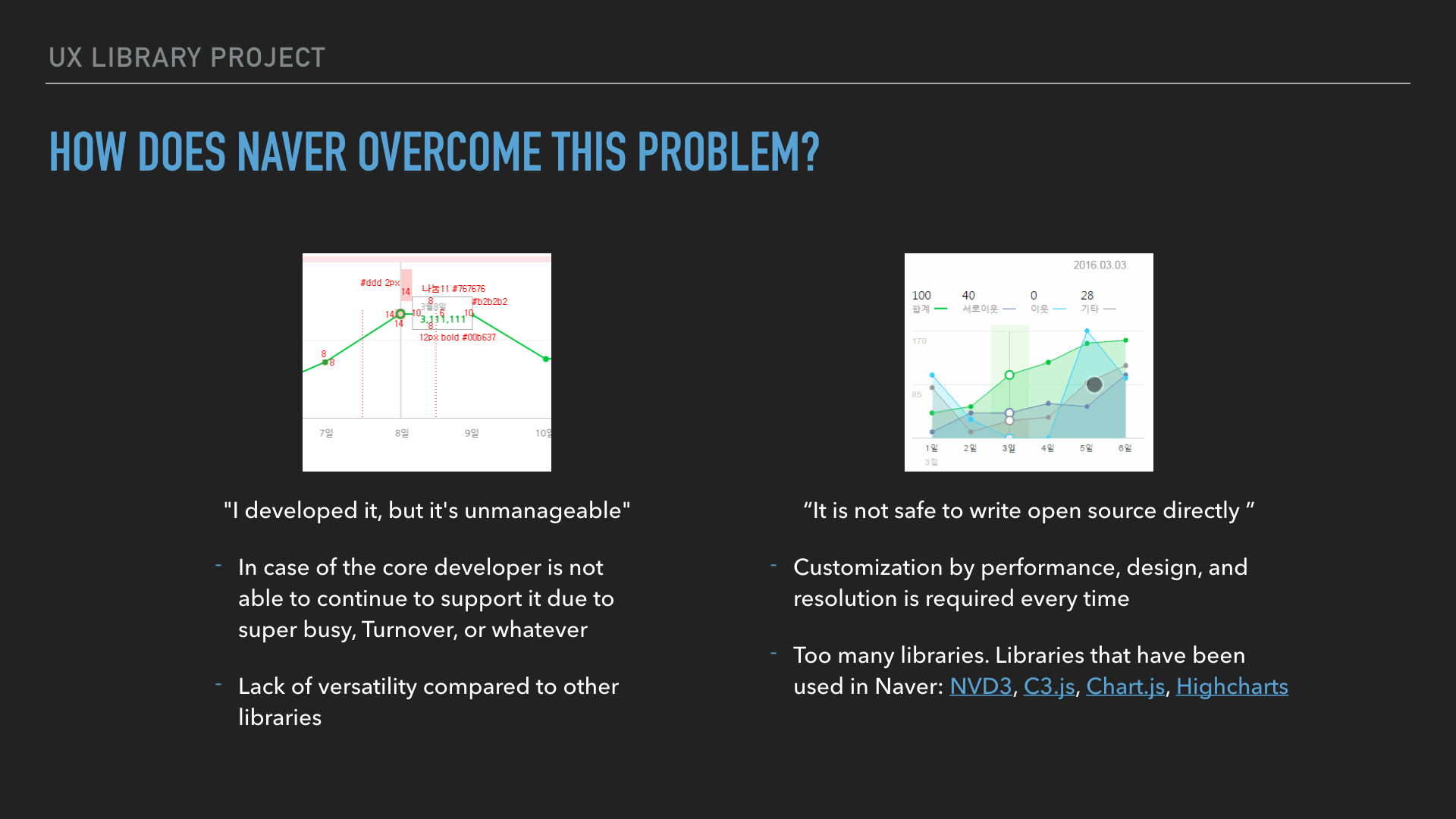
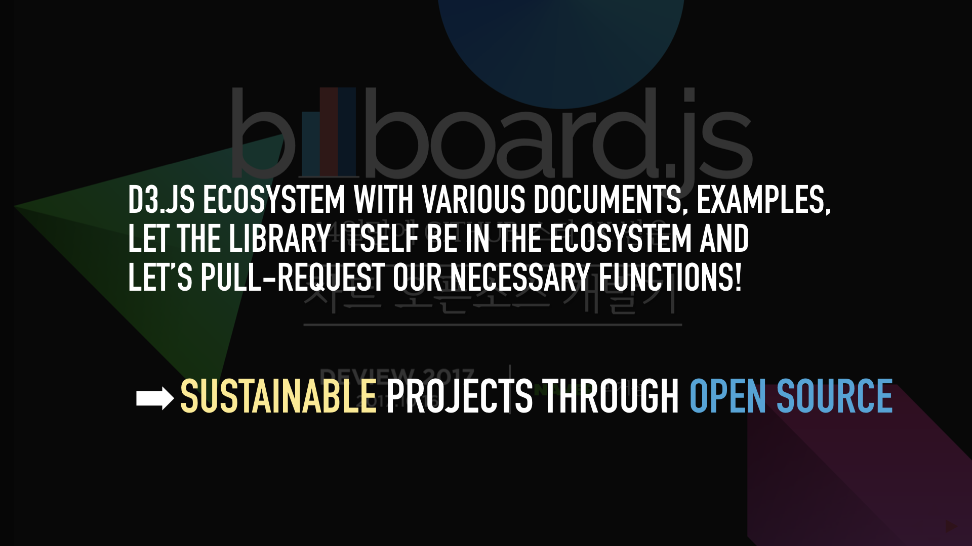
And billboard JS provided the clue for overcoming the limitations. Based on the D3.JS ecosystem, billboard JS maximized its management efficiency by indirectly contributing only to the functions that NAVER needs through Pull-Requests. Currently, NAVER Café and Blog are using this chart library to obtain statistics, and this chart library was ranked one of the most active opensource projects in Korea 2019.
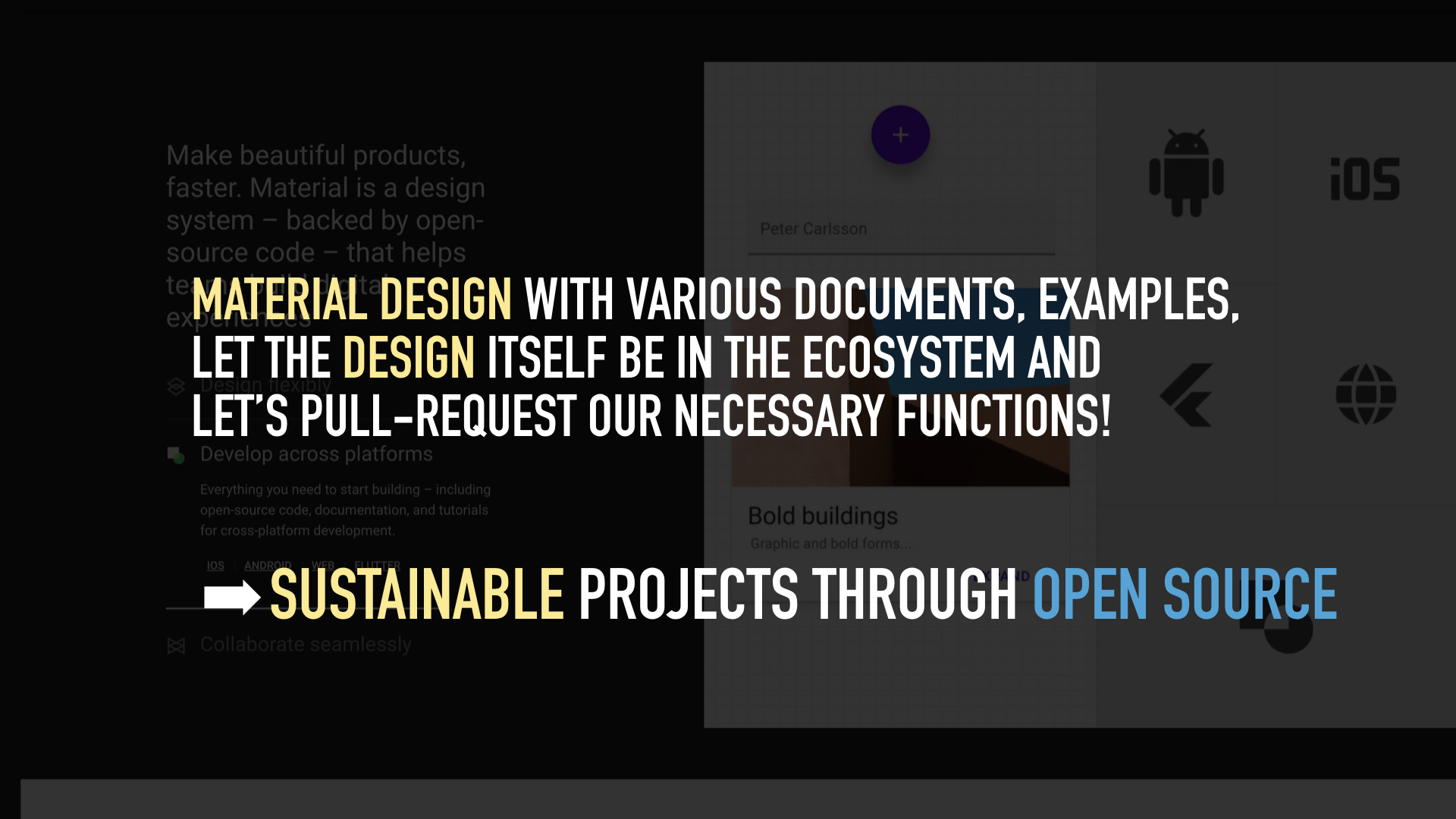
LOOKBOO decided to approach in the same method as billboard JS.
- Entrust the ecosystem of the Material Design with the development of design and library,
- focus only on creating the UX and component for the management tools that we need,
- and again contribute that result to the open-source,
We concluded that it would be possible to maximize the management efficiency and create a sustainable library, set the direction of the project, and decided to start on the basis of the Material Design, which is the most active and biggest open-source-based design system.
| billboard JS | LOOKBOOK |
|---|---|
 |
 |
Why, is it the expansion library?
In Material Design, many components have already been provided, but it is more like to focus on mobile platform rather than web. So, you will often need more complicated web component (such as data table) or very basic component (such as tab) while you are using it. We have decided to expand such a way as below when we would find these components while we built the admin site with Material Design.
Check the needed component
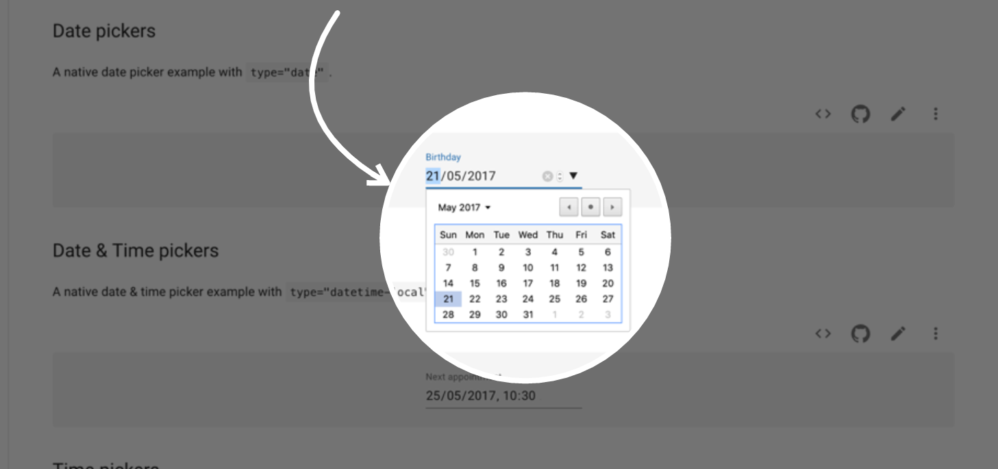
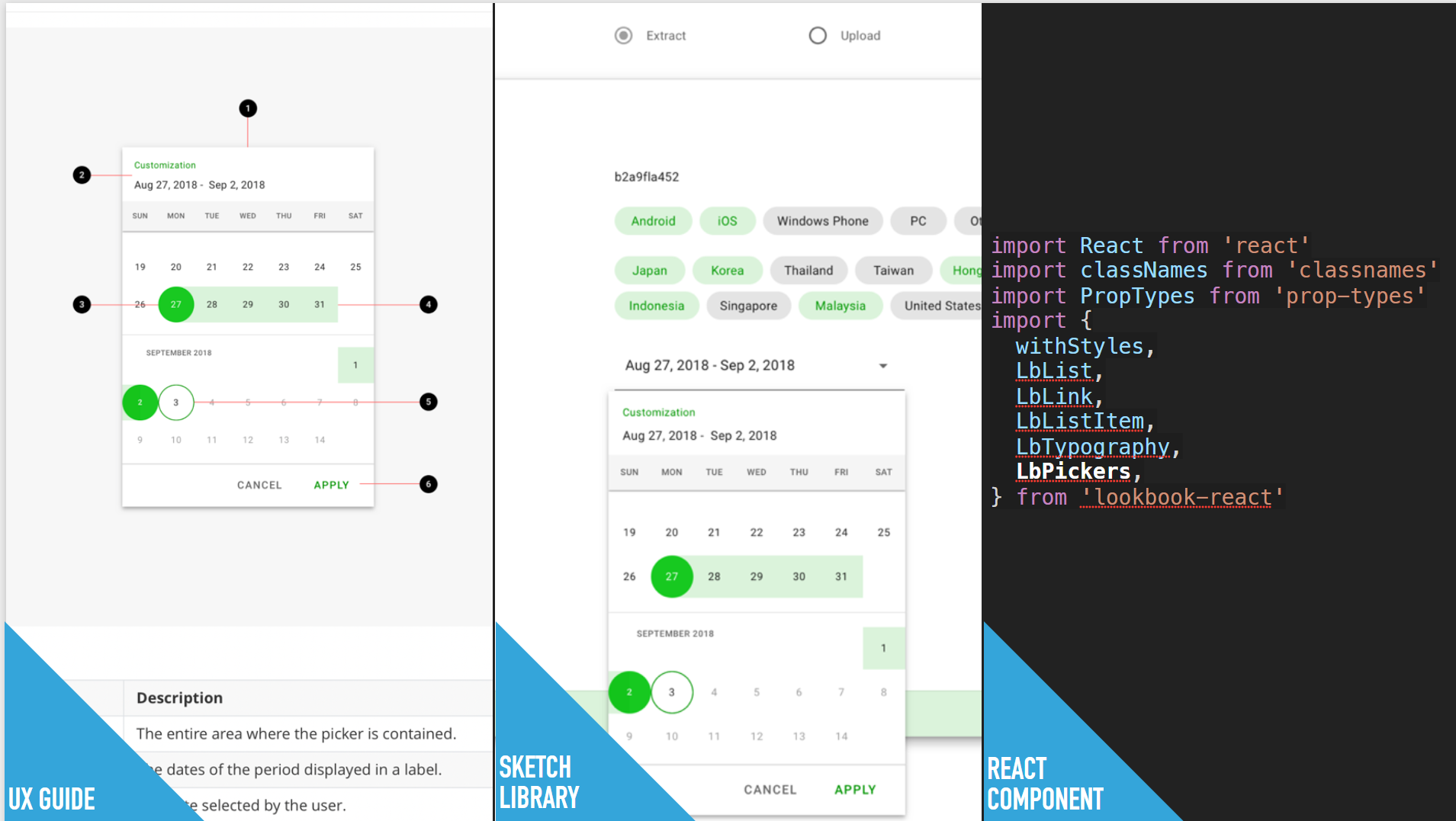
For example, in the case of the Date pickers component, it is a function that is used particularly often in the admin website. However, the calendar UI of the Date pickers that is basically provided is somewhat unsatisfactory in design, and it was difficult to use on a small mobile screen. In addition, it was also needed to allow the selection as a Range like ‘from when to when’.
If we cannot find any appropriate Material-UI based Date picker component from Github, we will create a new Material-UI based component.
Creating UX guide, Sketch library and React component
Firstly we will define the UX design of the required component and create a design kit for Sketch based on Google’s official Baseline.sketch. Then, we will create the React component to realize the completed design and create detailed specs such as props, state, and option. Finally, we will distribute these three(md, sketch, js file). (e.g. Pickers)
Case: LINE GAME Developers
Live at: https://developers.game.line.me
LINE GAME Developers(LGD) is a ‘Firebase’like web service, which provides LINE’s API and document to support game developer to enrich the game quality by using LINE messenger. LINE GAME Platform used LOOKBOOK while designing this product in the end-to-end process from the concept to product design. Down below explains the three main characteristics of how this project used LOOKBOOK.
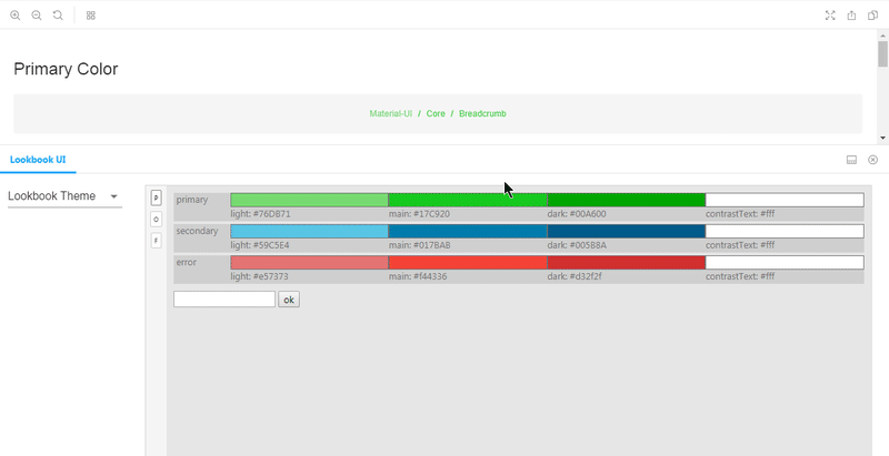
Material Theming
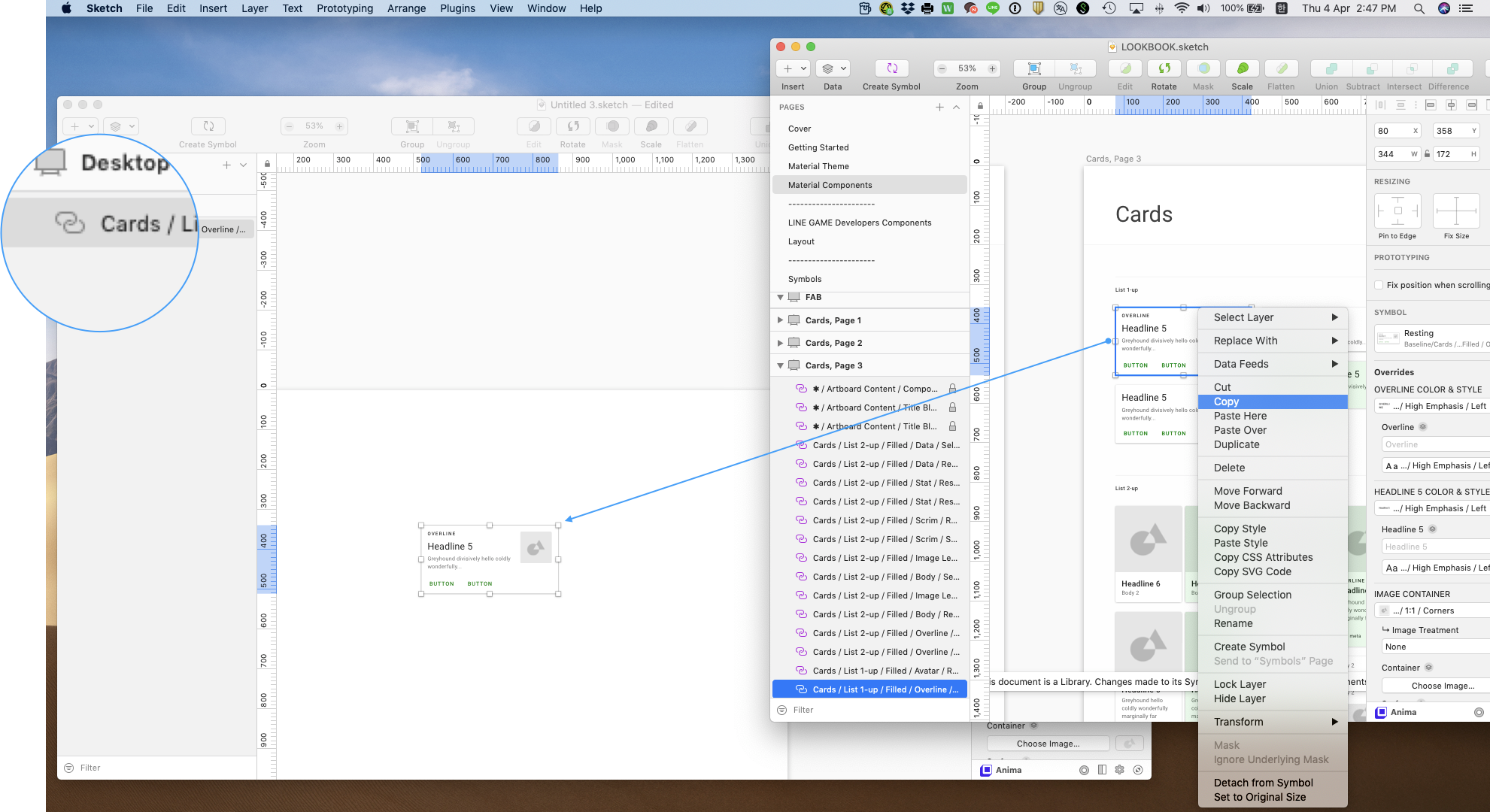
LINE has a variety of Family services which has it’s unique brand color, Typeface. Game platform also had to be usable with other brands, and LOOKBOOK was proceeded with Material Theming so it could product design collaboratively with designers using Material Theme Edior and LOOKBOOK.sketch.
We provided a way that if designer set the Color, Shape and iconography, and saved Theme in Baseline.sketch, then the Theme would be automatically updated in LOOKBOOK.sketch. All components of LOOKBOOK are always changed according to the brand theme like the video below.
Ready-to-use components
After the completion of theme settings, you can freely use all components of LOOKBOOK from your project, by copy/paste LOOKBOOK self-made components and Material Design’s all components as stickers.
Communication with dev
Lastly, its React component also has been designed to meet the same quality of Sketch components. For example, in Theming, React components have same options as design file changes according to the Material-ui framework. This kind of design system helps to increase efficiency of each product team, and improve designer’s workflow.
Curious? checkout Website
I am very excited about this project because I know that there is a lot of developers who are struggling at building ui and waiting for something like this to come true. It will take a lot of time for me alone to reach thousand components. So if you want to do something great and fun, please read our contribution section.